Update: Desktop and Dock in Mac OS X 10.10The integration between iPhone/iPad and iPad and Mac gives two significant new features here. First, web pages and other functions active on another device also appear in the Dock on a Mac so that the activity can be continued using the "Handoff" feature. And second, a new folder/Finder sidebar item called iCloud Drive appears which gives access to documents stored in iCloud on other devices. Any changes to this folder are reflected on other devices connected with the same Apple ID and running a recent version of iOS (for iPhones and iPads) or OSX (for other Macs). Update: Desktop and Dock in Mac OS X 10.9The Finder gets tabbed browsing (multiple locations in tabs can be open inside one window) which makes browsing between multiple windows much easier. The Finder also now supports tags. These are similar to labels in earlier systems except multiple tags can be applied to each documents and they are available for searching, selecting, etc, in multiple locations, including open and save dialogs. 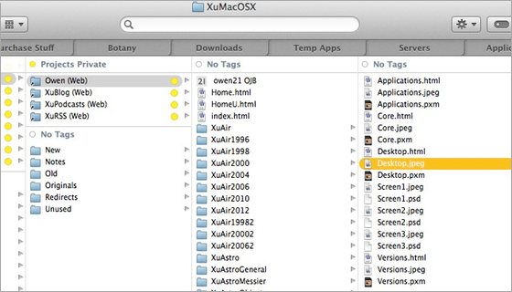
The Mavericks Finder showing tabbed browsing (tabs here show documents from these folders: Purchase Stuff, Botany, Downloads, Temp Apps, Servers, and Applications). The contents of the folders are also grouped base don their tags. The current tab is XuMacOSX which is off the left of this picture. Update: Desktop and Dock in Mac OS X 10.7 and 10.8There are no significant improvements in these systems. Update: Desktop and Dock in Mac OS X 10.6There's not a lot of obvious new features in this version of the Finder but underneath it is totally written using Cocoa. It has 64-bit support and uses Grand Central Dispatch system which gives better speed and improved performance where multiple functions are running simultaneously. Update: Desktop and Dock in Mac OS X 10.5The Finder has been completely rewritten using a more modern programming environment and it is much more responsive and handles multi-tasking much better than the previous version. But the suer interface works almost the same as older versions so there's not too much new to learn. There are many small changes which power users will appreciate. For example, the warning when changing file name suffixes can be turned off. And when a file is renamed only the name is highlighted and the suffix stays the same. These are subtle but useful enhancements. Update: Desktop and Dock in Mac OS X 10.4The Finder doesn't seem too much different in 10.4 than the previous version used in 10.3, apart from the system-wide additions of Spotlight and Automator. There are many small improvements though, that you start noticing when you use it, such as access to document meta-data. Speed seems to be better too. The Finder just continues to get more capable and solid, without being bogged down with incomprehensible detail. Update: Desktop and Dock in Mac OS X 10.3The Finder continues to evolve and become more functional. In 10.3 the greatest visible difference is the new brushed metal appearance and the sidebar which usually contains common starting points such as disks and major folders. It is also now possible to browse Apple and Windows (SMB) file servers from the Network item in the sidebar. The toolbar (at the top of windows) is now used for commands which is probably more logical because it separates objects (such as disks stored in the sidebar) from actions (such as new folder, stored in the toolbar). The new information dialog is also better. Changing privileges is easier and doing something that requires a privilege level higher than you currently have usually results in a request for an admin password instead of a refusal to do it. A secure trash empty function is now built in to the Finder - files in the trash are deleted so that they cannot be recovered. The new open and save dialogs are nice. They look almost identical to a Finder window so its easier to navigate to any particular item. The ability to have multiple users logged in simultaneously is also useful, especially if multiple people use the same computer. One user can leave their workspace totally open while another one logs in and uses the computer for a while, then the first user can return to exactly where they were. In the future we might see this extended to being able to use another computer as a "terminal" and have multiple users using the one computer at the same time - then mac OS X will be a real multi-user system! Mac OS X Desktop and DockThe Finder is changed significantly from earlier Mac system, although most users adapt fairly quickly. Here are some highlights of the new desktop interface the Finder provides... The new column view allows easy navigation down many levels of folders. Although this is different from the navigation we are used to from earlier systems it is the method most people use when they get used to X. Many file types can be previewed directly in the Finder, just click on the icon and a preview appears in the next column. Currently this works for text, graphics (JPEG, GIF, etc), movies (which actually play in the Finder window), sounds and AppleWorks files. Additionally the Finder will automatically use any preview stored with any file type. The toolbar at the top of Finder windows allows access to common functions. This toolbar can be easily customised with the users folders and functions. Connection to servers is now directly from Finder (there is no Chooser). Just choose the Connect command and either choose from the list or type the address (depending on the type of service you want to connect to). The Go menu provides quick access to common folders and your iDisk. Just choose the location you want to go to and it is immediately shown. Finally the Undo command is available for Finder operations. If you accidentally move a file to the wrong place, just undo it. Pictures and colors can be applied to individual window backgrounds. Instead of having to construct pictures out of many closely spaced icons it is possible to choose a graphic (JPEG for example) and have it displayed as a background. The DockThe dock is one of the more flashy new features of X - and one that initially received some criticism. Personally I wouldn't want to use anything else. The Dock packs a lot of functionality into a relatively small space. The Dock is a "bar" along the bottom (usually) of the screen which contains applications, documents, folders and docklets. Docklets are small mini-programs that provide functions when you click on them in a similar way to the Control Strip in older systems. The Dock can be shown and hidden, if its hidden it appears when the mouse is moved near it. Having the dock shown all the time is useful because information is shown in the icons it contains. For example the clocks "icon" in the dock actually shows the time, the CPU monitor shows the system load and Mail's icon has a number on it showing the number of new messages. Magnification is a feature which expands the icons which the mouse is over or near to. For example you can often read the text in a document icon as the cursor moves over it. The Genie effect is an animation which quickly "sucks" a window into the dock. This provides an extra visual cue about there the document has gone as well as looking really cool! Just to really blow people away, as movies are sucked into the dock they are still playing even as there windows are distorted into the genie shape, and they continue playing in miniature when they are in the dock. Another nice bit of attention to detail: if you hide a program with minimising windows, miniature docked version of the windows "jump" into the owner programs icon instead of just disappearing. The whole thing initially looks like unnecessary gimmickry but there is a real user-interface role there as well. If you control-click on an application in the dock a list of its windows appears allowing you to quickly navigate to a window based on which program created it. 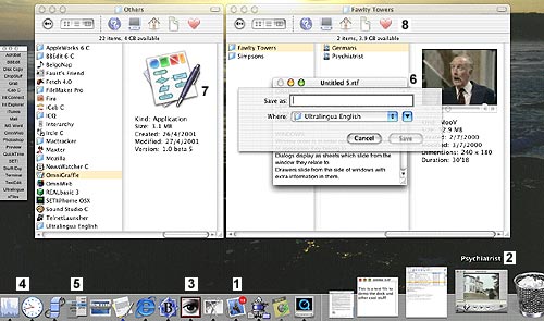
Some user interface elements of Mac OS X (sorry they are a bit small, much better on the real screen): 1. The Mail program with a small red circle enclosing the number of messages not read yet. 2. A movie playing in the dock. The pointer is near it so it is labelled and enlarged. 3. A Classic (Mac OS 9) program displayed in the dock just like all the others (which are all real X programs). 4. The CPU Monitor showing the current CPU usage (around 50%) and the clock showing the time. 5. A docklet. This is "Snard", a useful shareware launcher. 6. A window with a sheet displayed for saving. Notice that the sheet is translucent and displays the (second) movie playing through it and the movie is playing directly in the Finder. 7. A large icon and its information displayed in the Finder. 8. The Finder toolbar for various navigation functions. Other User Interface ElementsThe Mac OS X Quartz graphics engine is just so full of superb graphical features that it is hard to describe and the subtle functionality of the user interface controls, windows, etc takes a while to appreciate. Below are some highlights... Graphics on Mac OS X is through the Quartz graphics system, a sophisticated PDF-based graphics, layer which creates complex effects automatically such as translucency, flicker-free updates, automatic use of accelerators, etc. The 3D model for Mac OS X is OpenGL, a fast industry standard 3D system with wide support. Apple's QuickTime system provides support for playing movies, sound and other time-based media. Windows are layered in the order they are used. This can be confusing at first but quickly becomes more logical. For example a text editor window can be layered between two Finder windows. This tends to create less cases of windows covering other windows you want access to. The bring All to Front command brings all windows belonging to the current program to the front. Dialogs display as sheets which slide from the window they relate to. This means it is always obvious which window of which program a dialog is referring to. An example of attention to detail: if the window is narrower than the sheet it has generated and is near the edge of the screen, to make room for the sheet it shifts away from the edge while the sheet is displayed and shifts back later. Of course the shift is a smooth movement, not just a jump. Not a big deal, but it all helps. Drawers slide from the side of windows with extra information in them. For example instead of cluttering the viewing window or requiring an extra window to list mailboxes, the Mail program just slides a "drawer" out the side of the main window when required. Window controls are colored lights. Red means close, yellow means minimise and green means zoom. Sounds confusing, why not use symbols? Well they are there too, but people seem to intuitively know what the colors mean anyway. The window controls are available when the window is in the background so you can work with windows without having t move them to the front first. If the window has a toolbar (a fairly standard feature) there is a standard show/hide toolbar control in window title bar. The default button in dialogs pulse with the blue Aqua look instead of just being outlined. Scroll bars are proportional and can optionally scroll to the position clicked instead of a page at a time. The Apple menu allows access to System functions from anywhere, for example About this Mac, Sleep, Logout. It is not currently customisable. The standard About, Preferences, Hide, etc items are in a standard location in the application menu. Menus are translucent. All operations continue while menus in use. For example you can see through a translucent menu as a movie plays while it is minimised by the genie effect into the dock. At the same time as an application launch icon bounce is hidden beneath the genie (yes, I tried it - works perfectly) ![[Up]](../XuShared/Up2B.jpeg)
Insert query failed: INSERT INTO log VALUES (NULL,1,'2025-12-23','134823','Desktop.html','XuMacOSX','216.73.216.208','Mozilla/5.0 AppleWebKit/537.36 (KHTML, like Gecko; compatible; ClaudeBot/1.0; +claudebot@a','');. |